No Place Like Home: A Modern Abode
/
Story & Photography by Lindsay Allison
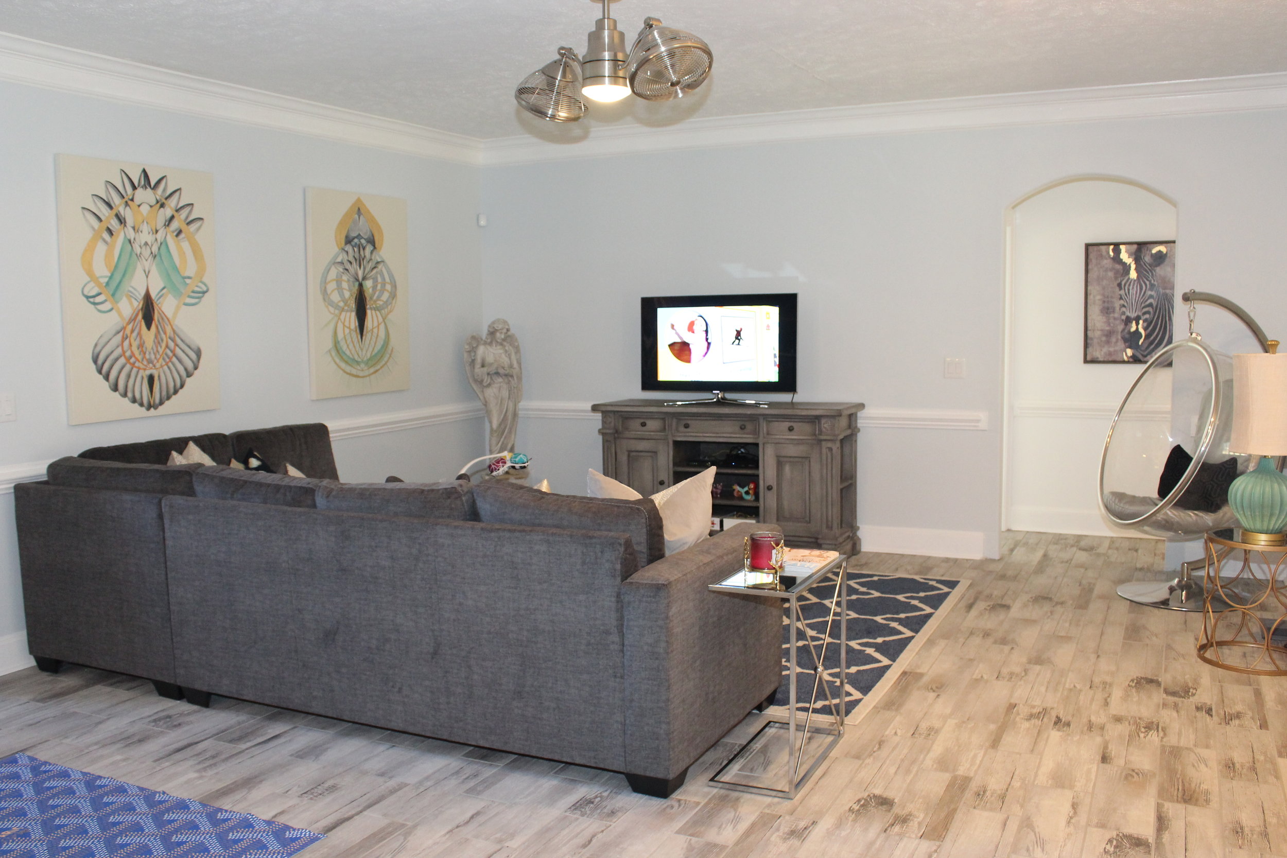
A young couple with modern ideas and old-school vibes decided to renovate a home built in the early 90s. Taking cues from their favorite fashion designers, Jamar and Crysta Hardiman turned the home into a modern oasis filled with nostalgic pieces and a comfortable environment in which their family could nestle.
Needing to meet a certain deadline due to an unexpected but exciting addition to the family, the couple took matters into their own hands by designing and helping their crew with the intense task that laid ahead.
Designer of the Home
The house was built in 1992 as a custom home. No information is known about the builder. However, the couple came up with the new layout and interior design of the remodel. They saw the home’s potential and knew it had good bones for a beautiful remodel. They were expecting their third child and gutted the house within 90 days. Eager to change everything, the owners left nothing the same including the floor vents.
Decorator of the Home
Jamar and Crysta enjoy decorating and started the process as soon as an offer was made on the house. Fashion inspires their décor taste; therefore, each piece was thought through with fashion in mind. Some of their favorite pieces were found at Neiman Marcus, Ralph Lauren Home, Erica King Interiors, Restoration Hardware, Z Gallerie, At Home, Target, antique stores, and showrooms in Atlanta with whom they have relationships.
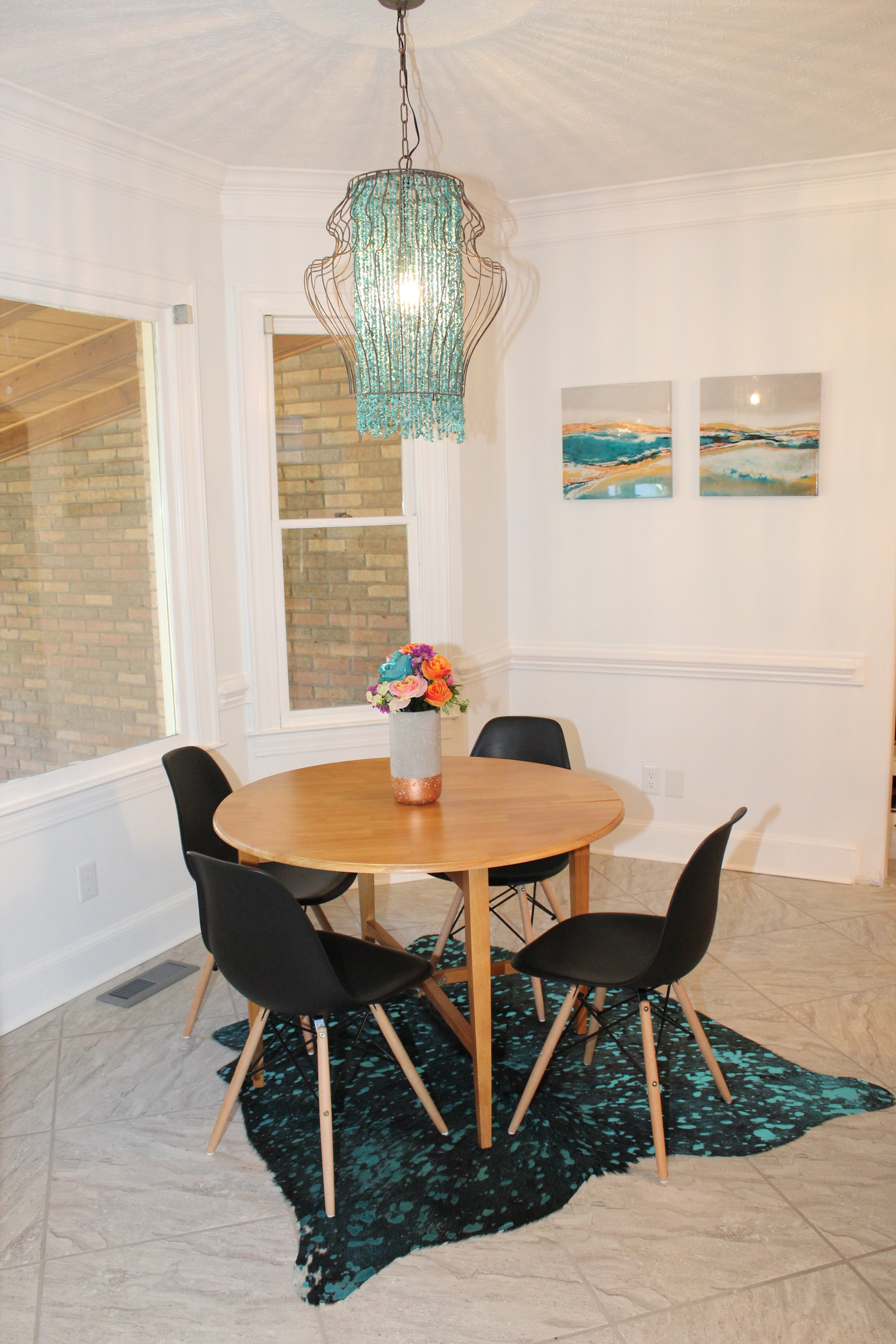
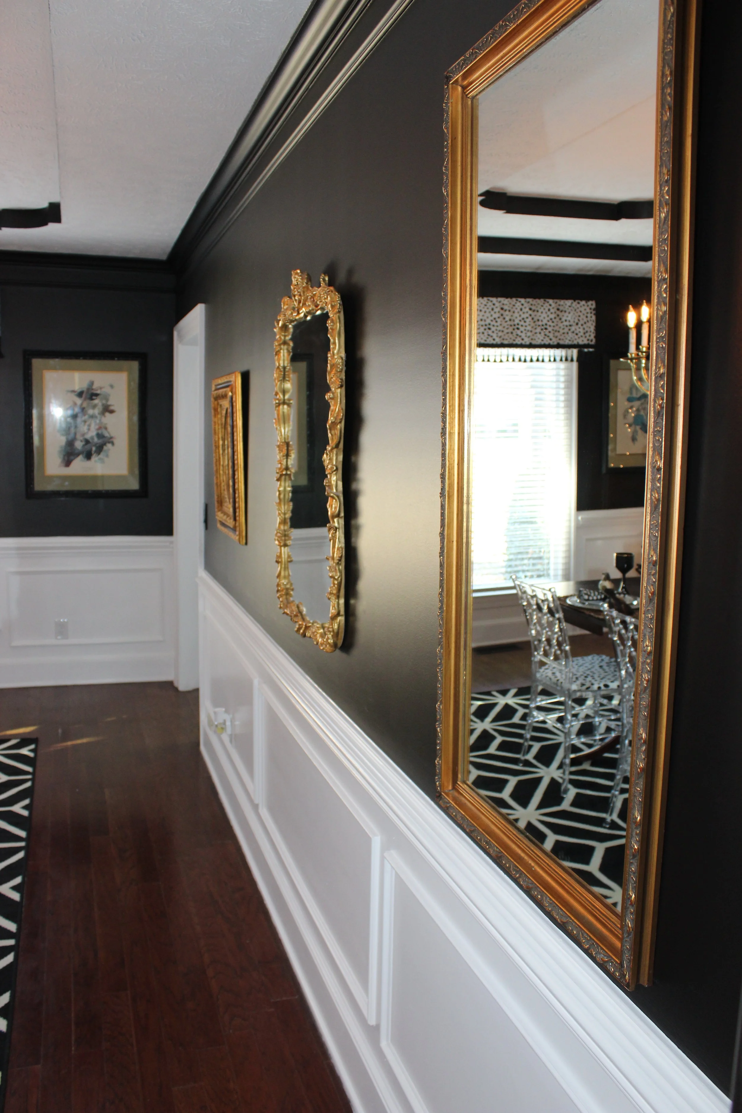
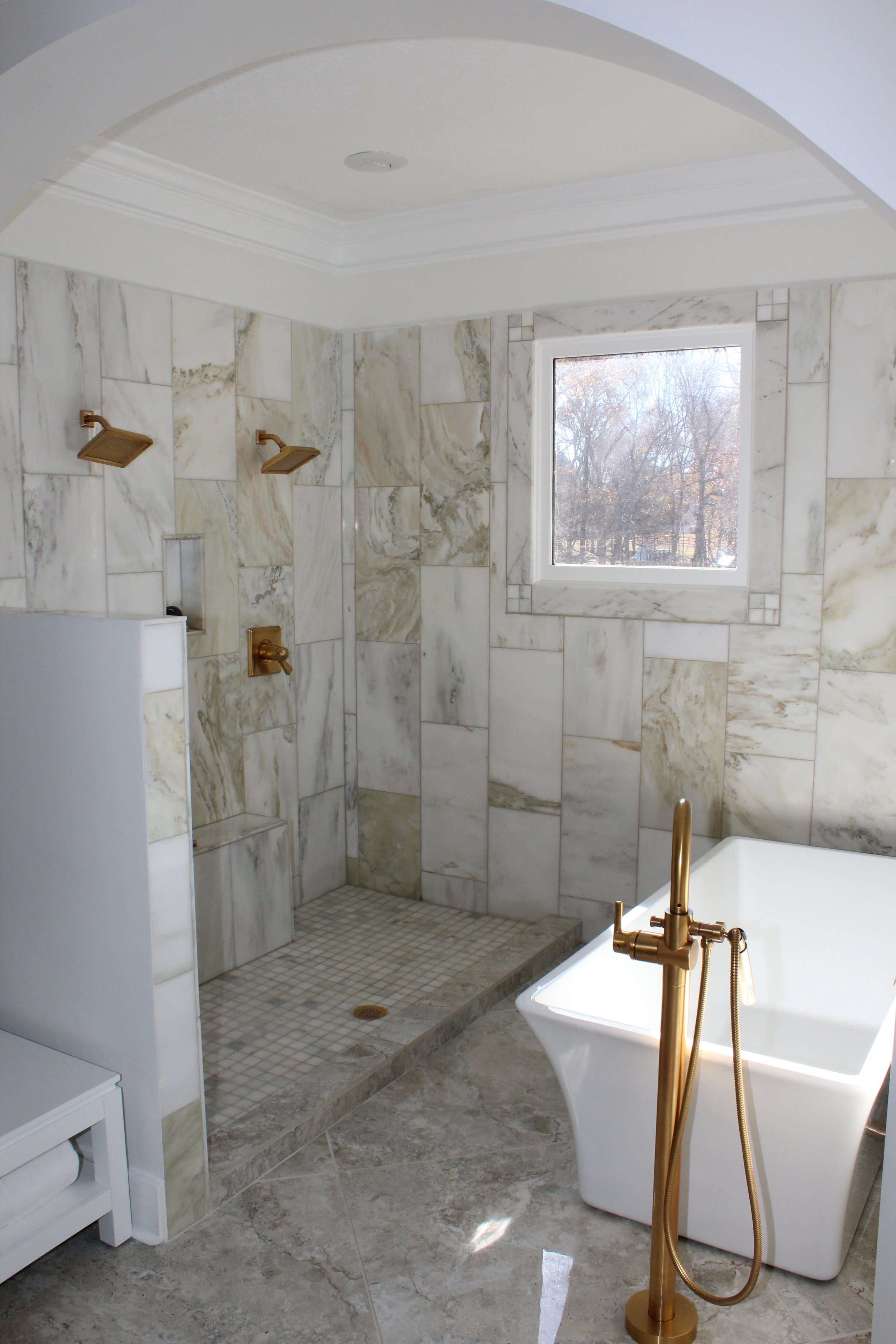
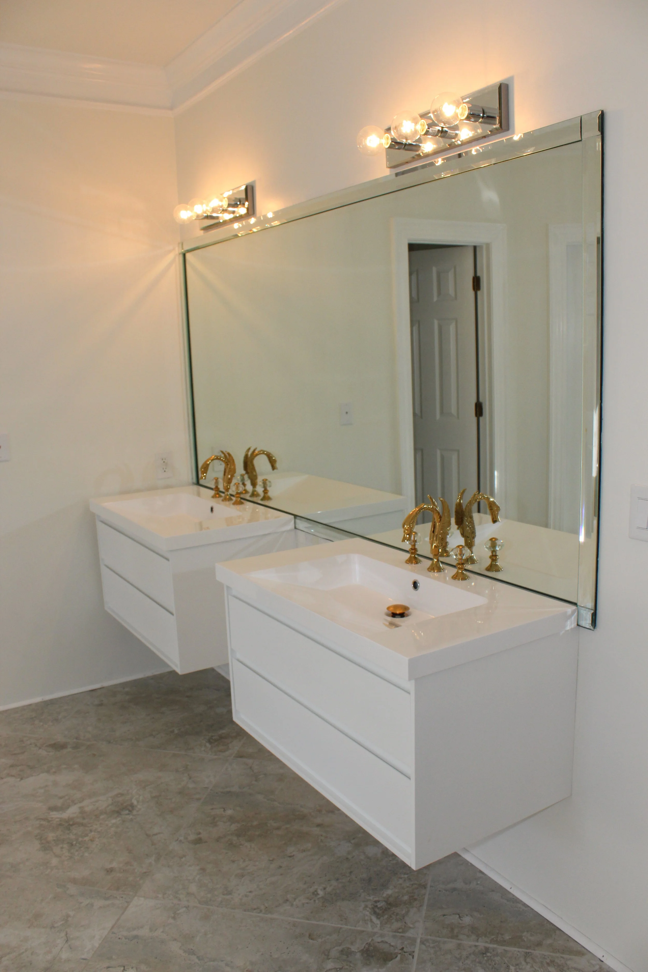
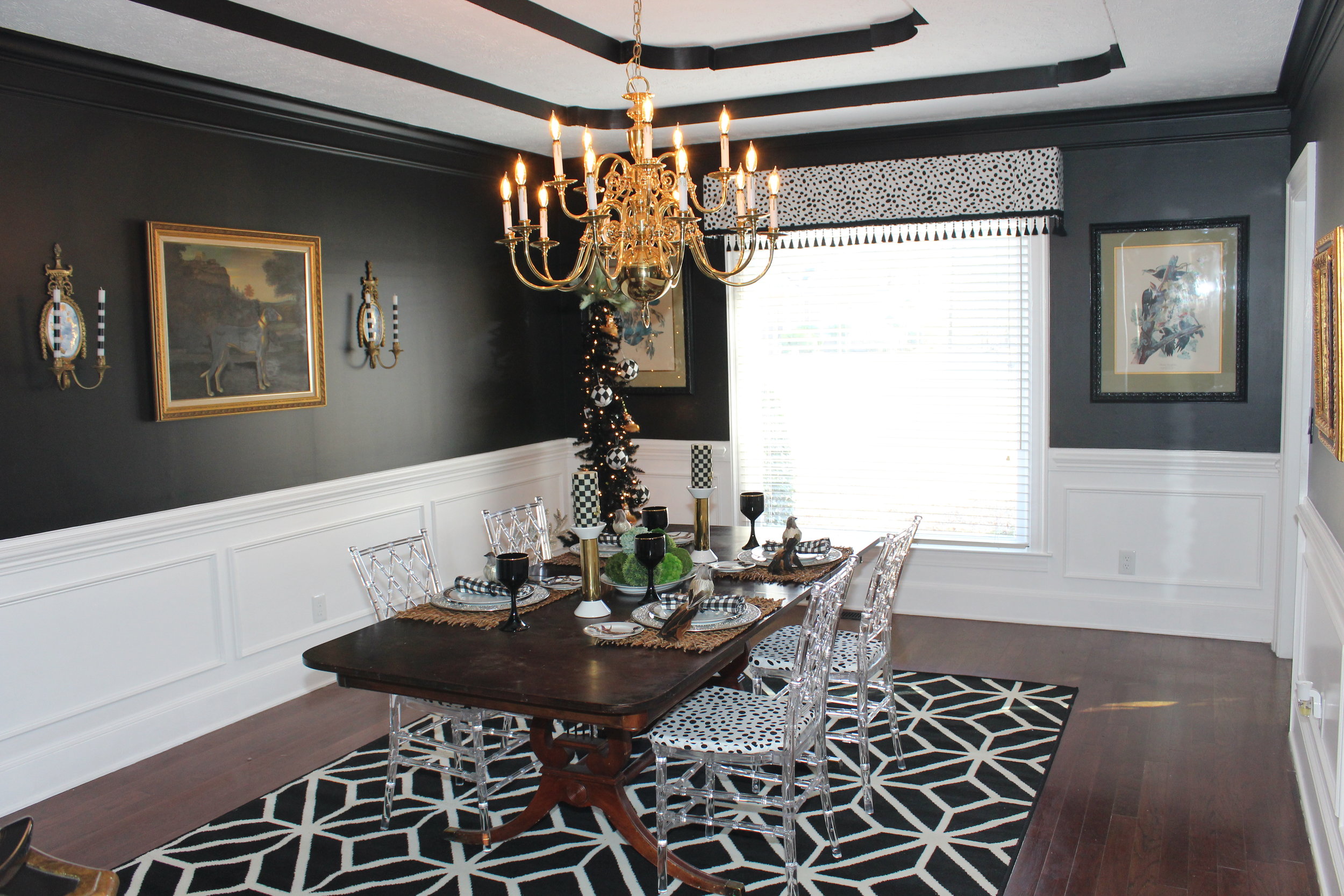
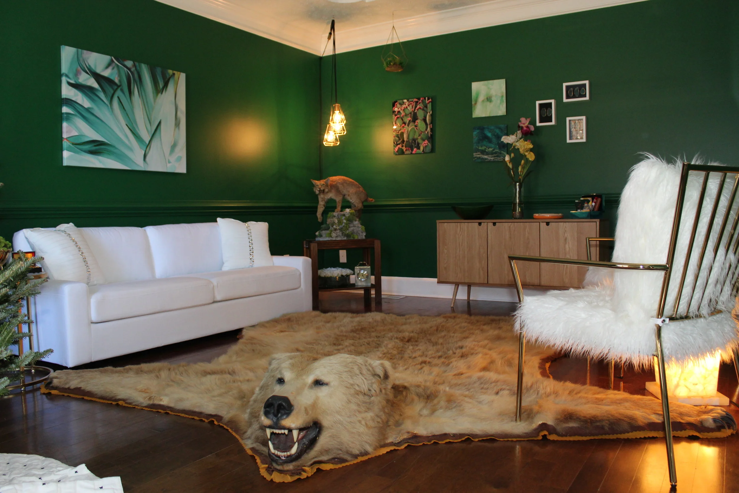
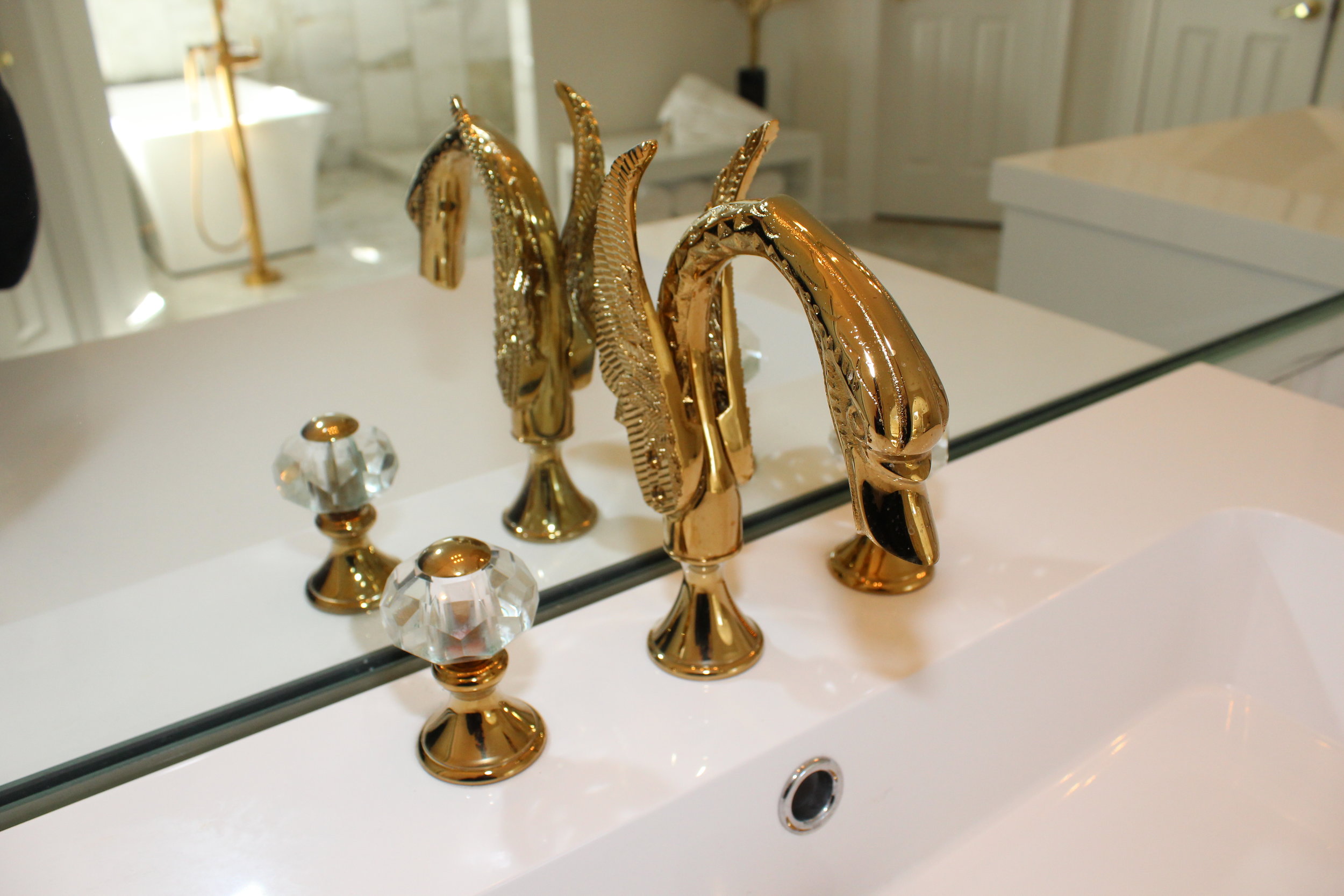
They had a different inspiration for each room. The dining room was designed around a painting of a dog which Jamar bought at an estate sale. It has an old world yet contemporary look. The formal living room was inspired by their love for Gucci and the fashion label’s incorporation of animal prints with bold colors. A blonde grizzly rug and a bobcat were used against Kelly green walls. The turquoise beaded light fixture in the kitchen is from local interior designer, Erica King, and was the focal point for the kitchen. It was purchased years ago and kept in storage for a home to come. If you pay close attention you will notice every color in the house pulls from the large canvas of Santorini, a painting that has been in storage waiting for a home. The master bath design brings a Miami feel to the home. The couple travels a lot, and Miami is one of their favorite cities. The overuse of onyx and marble was a must to create this look. The marble flooring came from Floor and Décor and the faucets are Delta with custom plating out of Nashville.
Design of the House
Crysta describes the home as clean, modern, bold, and welcoming. Only a few changes were made to the layout of the house. These changes included making it more functional for a family. Opening the kitchen to the living room was essential for the family because cooking and meal time are very important to the family.
The couple also built a wall between the dining room and kitchen to add privacy to the back of the house from street view. In addition, a mud room was built off of the laundry room. The entire master bathroom was opened to form a wet room concept with a spa environment.
A few cosmetic changes included changing all the standard cased openings to contemporary arched openings without molding.
Personal Touches
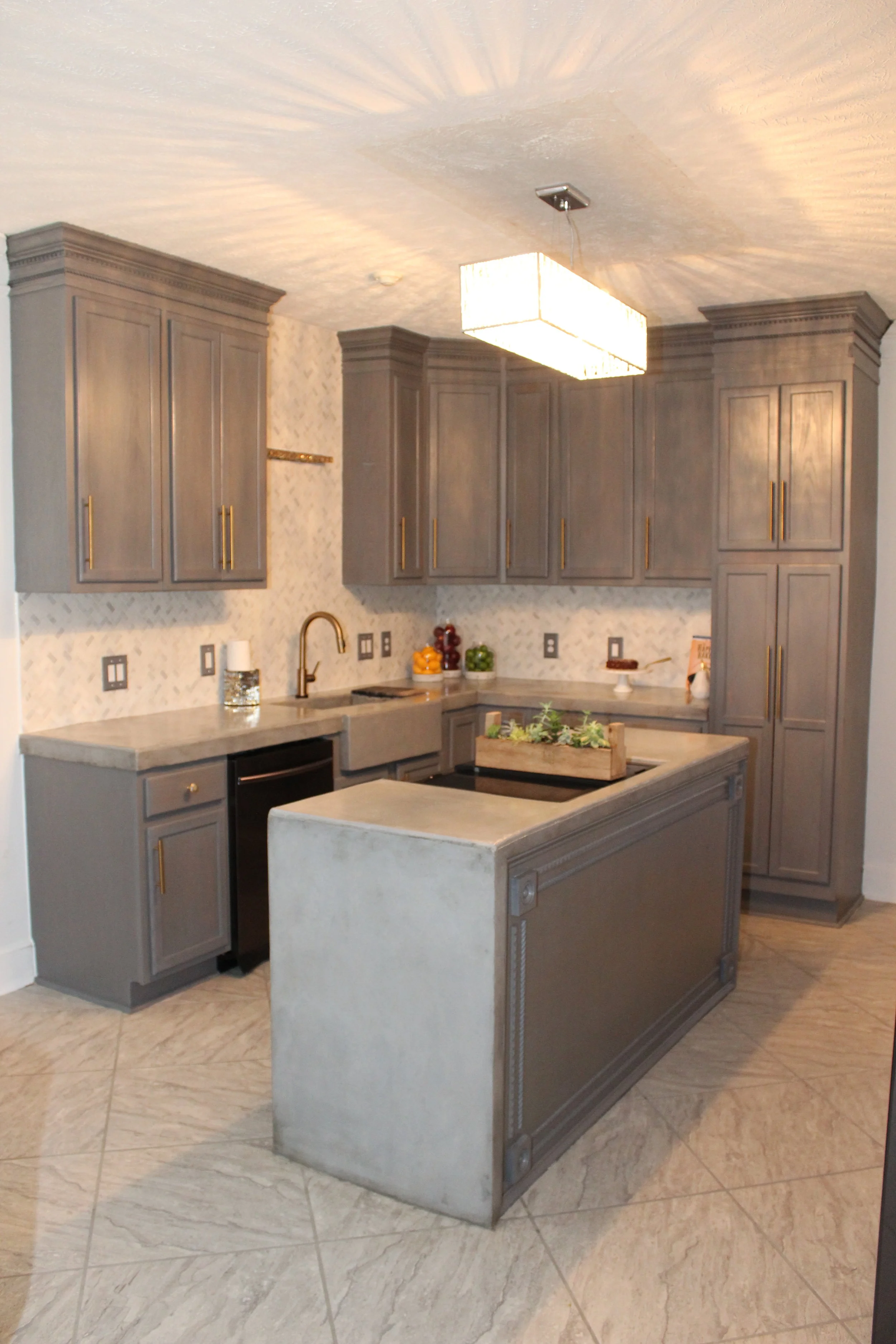
Personal touches are all over the house. The faucets in the master bathroom were custom gold plated in Nashville, Tennessee. The master bathroom cabinets were suspended to give it a spa feel (they even debated on making room for a sauna). The walls in the open shower are floor to ceiling marble. It’s art in itself. Kitchen counter tops and cabinets were designed by the couple all the way up to the molding in a violet grey color. The countertops are concrete. Over the past few years they had decided when they built or bought a home, they would install concrete countertops. They didn’t want prefabricated. They wanted an old-world Tuscan style that was authentic, flaws and all! The couple had a grand time watching the process of the concrete countertops being formed, which included concrete trucks pouring buckets of concrete to form the kitchen and custom farmhouse concrete sink.
“Our kitchen counters looked like sidewalks for about a week, but I knew the end result would be fabulous,” said Crysta. The marble slab in the half bath was, again, something they purchased a long time ago.
“We had one great piece for each room and built around whatever that piece was,” said Crysta. “We changed floor vents to match each room. It was the small details that really completed the remodel. No stone was left unturned.”
Favorite Aspect of the Home
“I love that each room has a story of its own and was built around special pieces,” said Crysta. “The master bath has so many high points! The suspended cabinets, the gold swan faucets, the floor-to-ceiling marble, the arch. There is so much to love in there!”
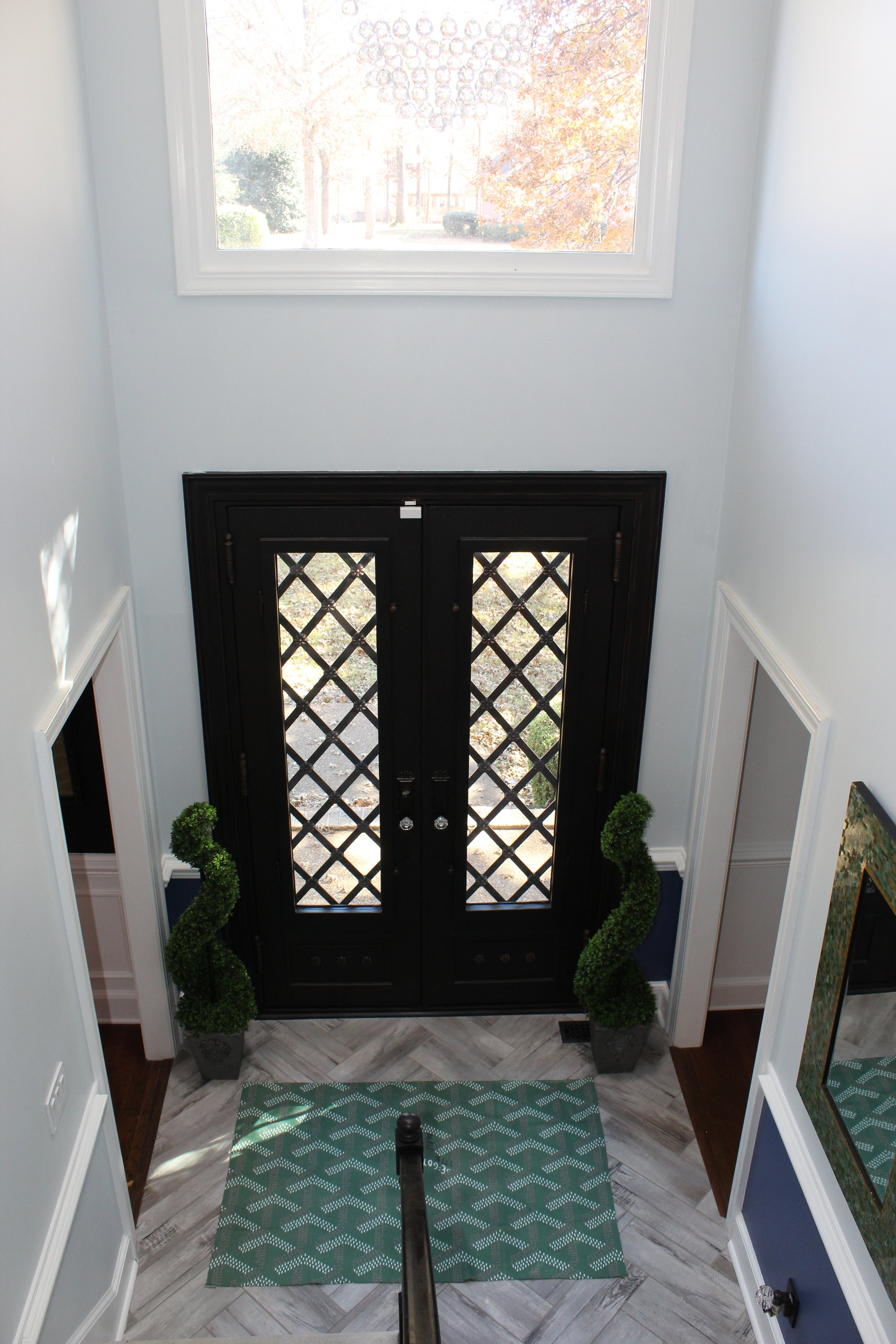
“My favorite aspect of the living room is the floor to ceiling white quartz fireplace,” she added. “I love how it glitters in the light. It was actually a last-minute decision. We had no ideas for the fireplace. We went to pick up our marble and came across a sample and we both said simultaneously that the quartz would be the focal point! The fireplace is visible from the front door so it needed to be a showstopper.”
“I have several favorites in the kitchen,” said Crysta. “The molding, which is a Greek key pattern, the cabinets that are flush to the ceiling, the herringbone marble backsplash that ties into the entry and half bath tile, and of course the concrete counter tops.”
Crysta says she loves everything about her dining room. “I loved being able to tie in antiques and family heirlooms with our own contemporary style,” she said.
“Favorites from the formal living is again—everything. One thing that stands out for me is the shadow box representation of our blended family. We have 3 boxes. One for Jamar and me, another for our 3 children, and a third box for his older children. I thought it would be a cool way to celebrate our family and the life we have created together.”

