No Place Like Home: A Designer’s Vision Brought to Life
/
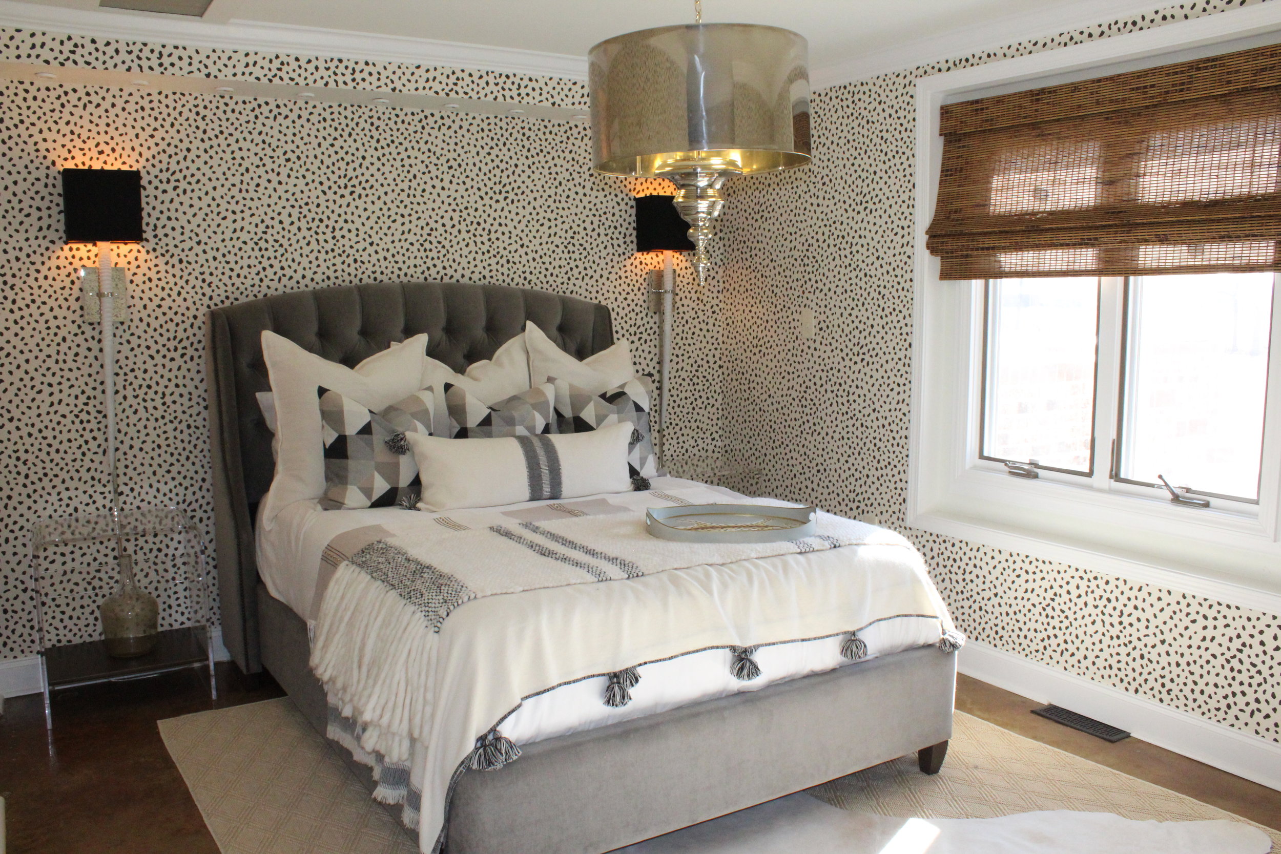
Story & Photography by Lindsay Allison
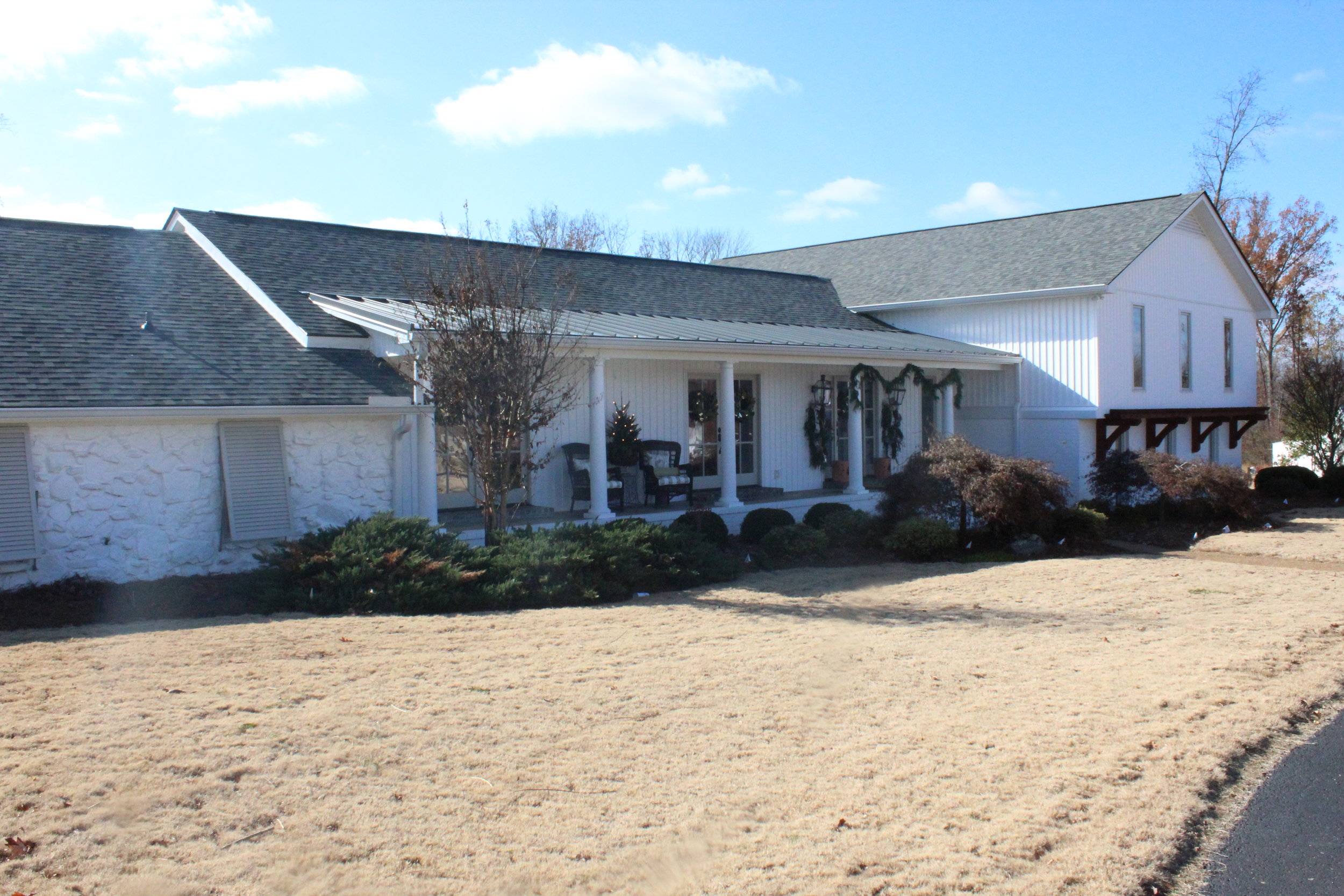
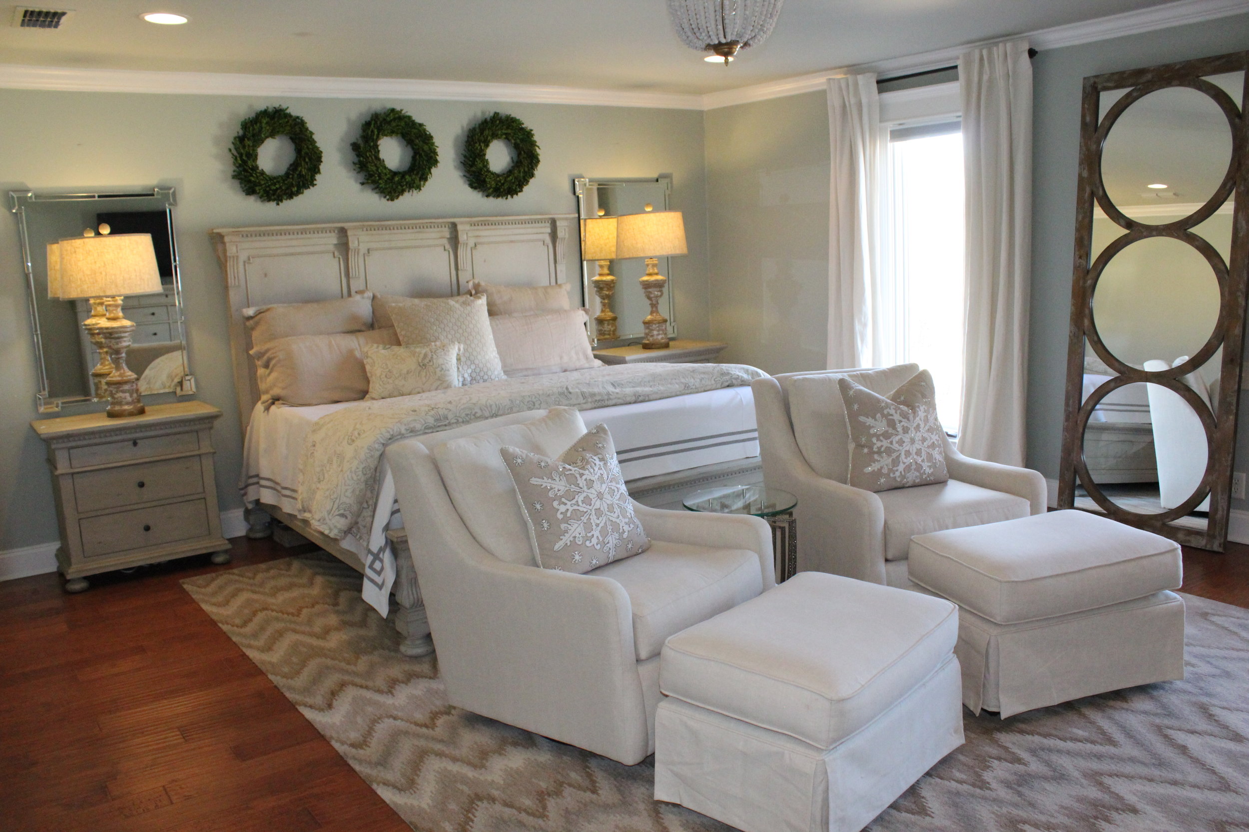
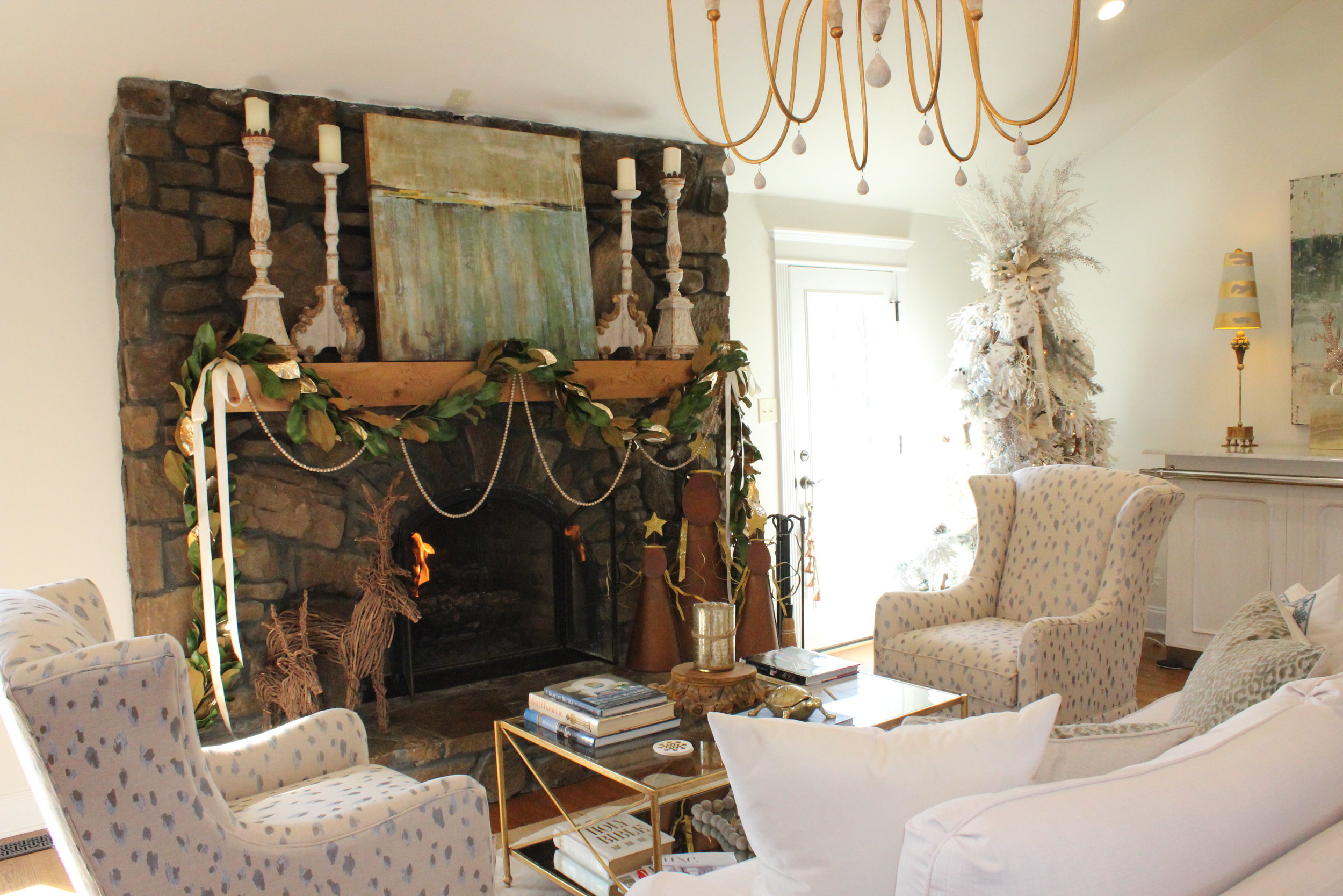
Curt and Erica King, Jackson natives, wanted to renovate a home in a French country style, while keeping a neutral palette with pops of colors and patterns. Many walls were knocked out in order to make a free-flowing space for their family to move around in and entertain their many friends. Curt works for King Tire Company on Old Hickory Boulevard where he is a third-generation operator and manager. Erica is the owner and operator of Erica King Interiors and prior owner of The Highland House Home Décor and Interior Design in Jackson. The home, which is exceptionally decorated at all times, is even more special during the holidays when Erica transforms the home into a wonderland for the eye.
Who was the main designer for this home?
I was the designer for the home.
Is it new construction or a remodel?
This home was a remodel. I always had an urge to remodel a home, and this house literally fell in our laps at the perfect time.
Who is the builder and what year was it built?
Built in 1977, this ranch-style house has gone through three owners. It has undergone two major additions and renovations with a few more designs ready to be started. Jim Hollman Construction played a big role in helping our vision become reality.
Who were the main vendors that were used to decorate the house?
Many of the products seen in the home come from vendors supplied by me through my design business, Erica King Interiors and prior store, The Highland House. There’s not one particular vendor used through any part of the house due to my eclectic taste. I like to just let the room tell a story based on how I feel when designing it.
How would you describe the design of this house?
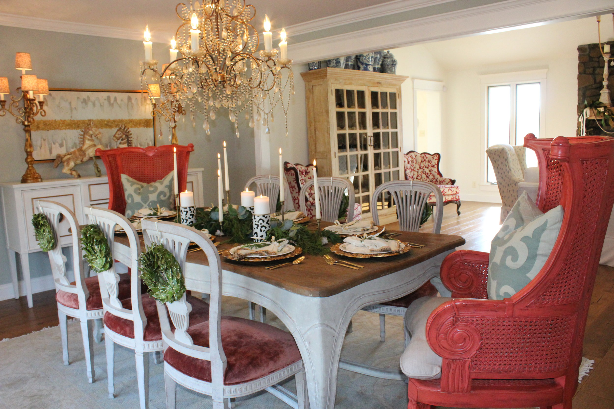
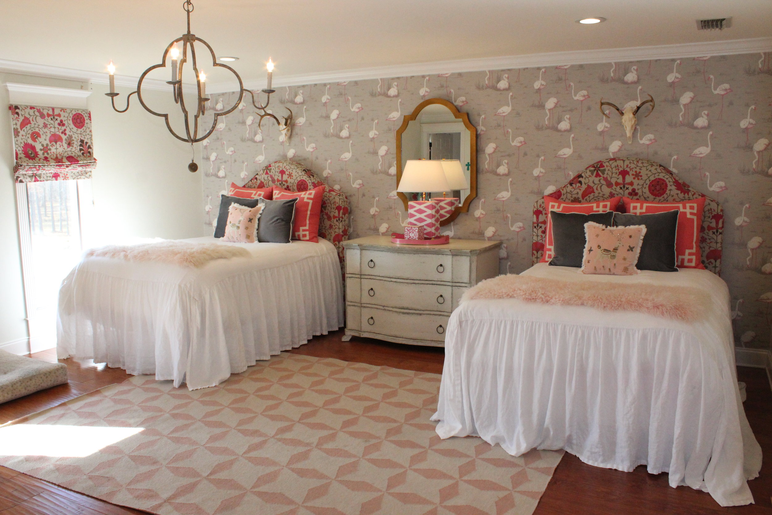
Well, it depends on which room you’re standing in. I would describe the design of this house as transitional French country, if there is such a thing. I tend to lean more toward a feminine design with a neutral base with rich pops of color and pattern. I also apparently have a love affair with all things leopard. I don’t think there’s a room in the house without a peek of leopard or animal print somewhere.
What are some specific personal touches that you used?
Throughout the home, and all of my clients’ homes, I like to use a play on pattern whether it be on the walls, windows, fabrics, or all of the above. I used lots of different textiles and wallpapers throughout each room to give the eye something to look at. Patterns and colors can provide a visual story of who you are, and layers of pattern and color always provide for the eye to be entertained.
What is your favorite room and why?
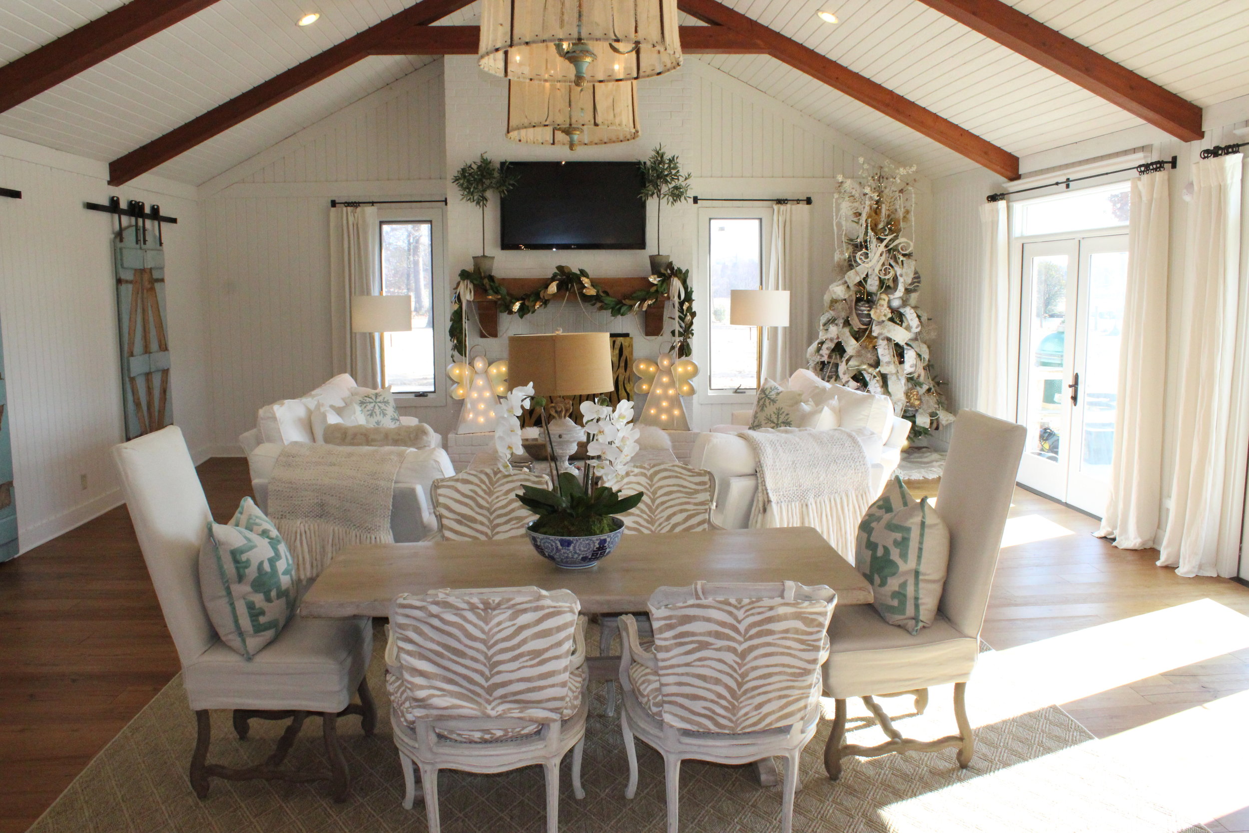
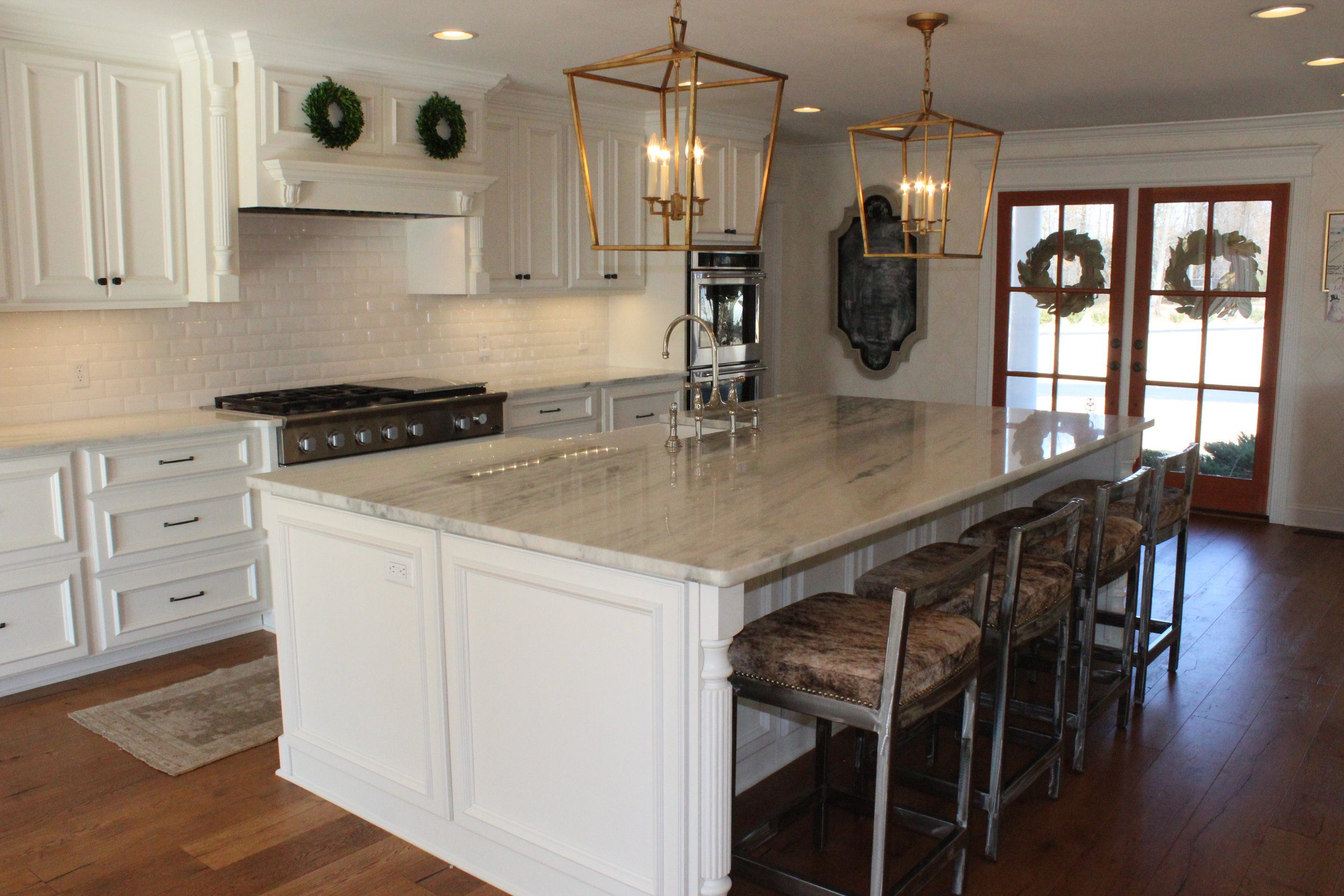
This is a hard question to answer because each room gives me a sense of satisfaction. If I had to choose, though, I’d say my favorite room in the house is the kitchen/great room. We had to move lots of walls, rework the entire floor plan and install two intersecting load-bearing beams to make this open concept work, but it was completely worth it. It’s where we live 75% of the time. It’s where we do homework, entertain family and friends, cook, clean, and visit with one another. They say the kitchen is the heart of the home and in this house that’s the absolute truth. I would have to say my favorite design feature of this room are the three pairs of original French antique barn doors that date back to the 1890s and were the basis for the design of the two drum chandeliers, which also happen to be a personal favorite.


